


The Summer Edit
Let's be honest about the British summer. It arrives sometime in late May, disappears for a fortnight in June, comes back briefly in July, and then spends August doing something ambiguous behind a layer of cloud. We get roughly six weeks of genuine warmth if we are lucky, a handful of evenings where eating outside is actually pleasant, and one bank holiday weekend that surprises everyone by being nice.
Which is precisely why the colours you put on your walls matter more here than almost anywhere else. You cannot rely on the light to do the work for you. The right paint shade on a north-facing living room wall can do more for your mood on a drizzly Tuesday in August than any number of scatter cushions. We know this. We have lived in these houses.
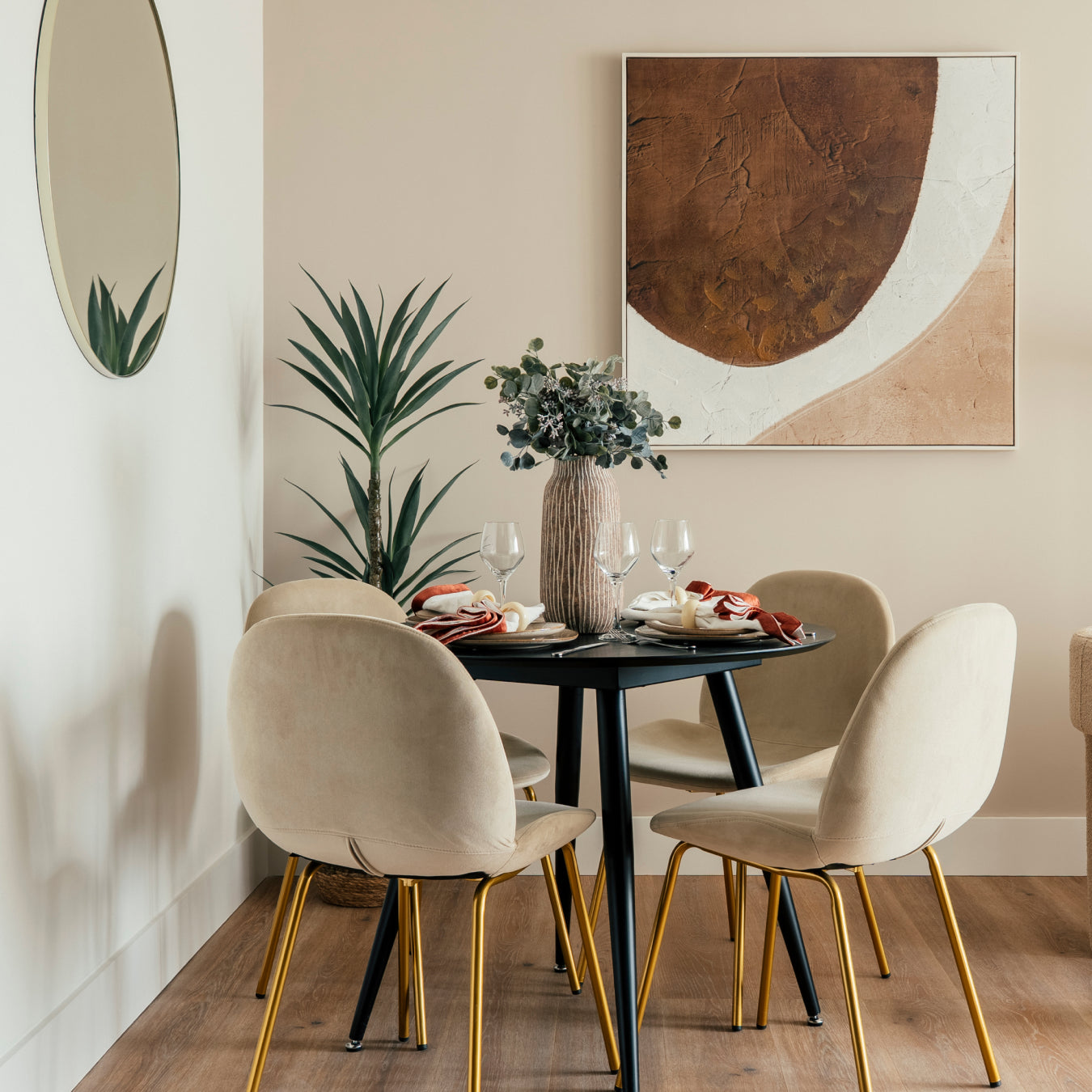
This summer we are reaching for four colours. A soft off-white that catches whatever light is available. A cherry blossom pink that brings warmth without sweetness. And two blues that bring the feeling of somewhere sunnier without making your sitting room look like a swimming pool.
Here is what we chose, and why.
The four colours at a glance
- Ibiza Moon — a soft warm off-white, samples from £5.50
- Kyoto Blossom — a gentle cherry blossom pink, samples from £5.50
- Santorini Azure — a barely-there Mediterranean blue, samples from £5.50
- Baja Seas — a cool refreshing blue with real depth, samples from £5.50
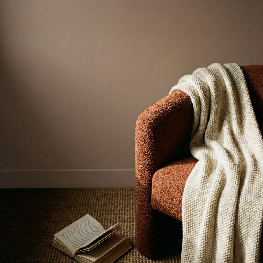
Ibiza Moon

There is a particular quality of light just before dusk on the Balearic coast. The sun drops below the clifftops and everything turns this soft, warm, barely-golden white. Not quite cream, not quite stone, not quite anything you can name precisely. That is Ibiza Moon.
We chose it for the Summer Edit because it does something quite specific on British walls. In a room with south-facing light it becomes luminous without looking clinical. In a north-facing room, which let's face it most of us have at least one of, it stays warm rather than turning that cold flat white that makes a room feel like a dentist's waiting room in January.
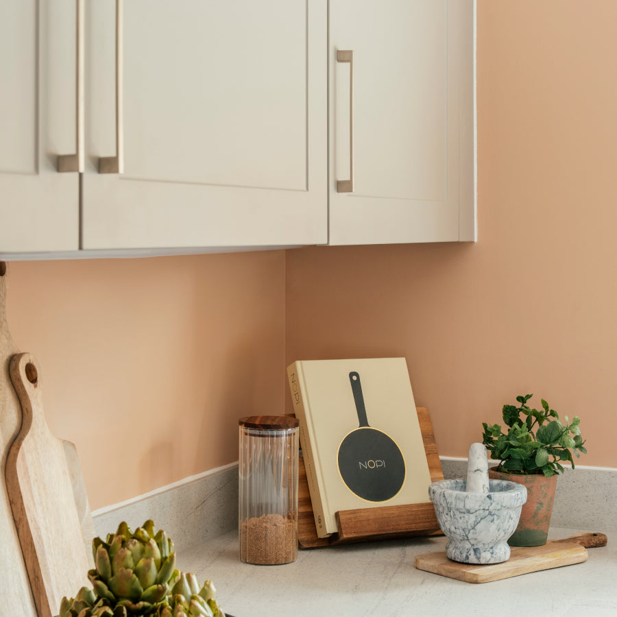
It works beautifully in hallways, where first impressions matter and natural light is usually limited. It is also one of those rare whites that looks genuinely considered in a new build, where bright stark white is the default and usually the wrong choice. Pair it with warm wood floors or natural textiles and it becomes exactly the kind of effortless neutral that takes a room from fine to properly lovely.
Being ultra low VOC and water-based, there is no smell to air out while you are trying to enjoy the summer either. A practical consideration that is easy to overlook until you are sleeping in the spare room because the bedroom still reeks of conventional paint three days later.
Order a sample of Ibiza Moon from £5.50.
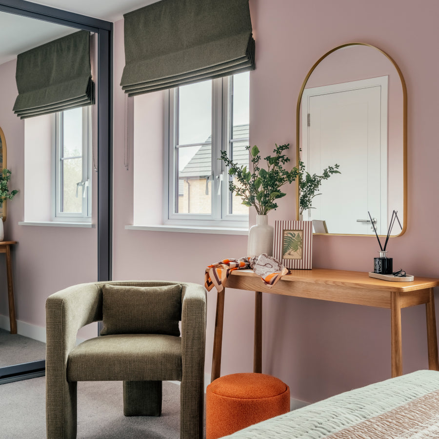
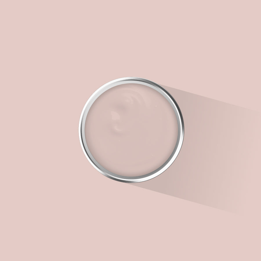
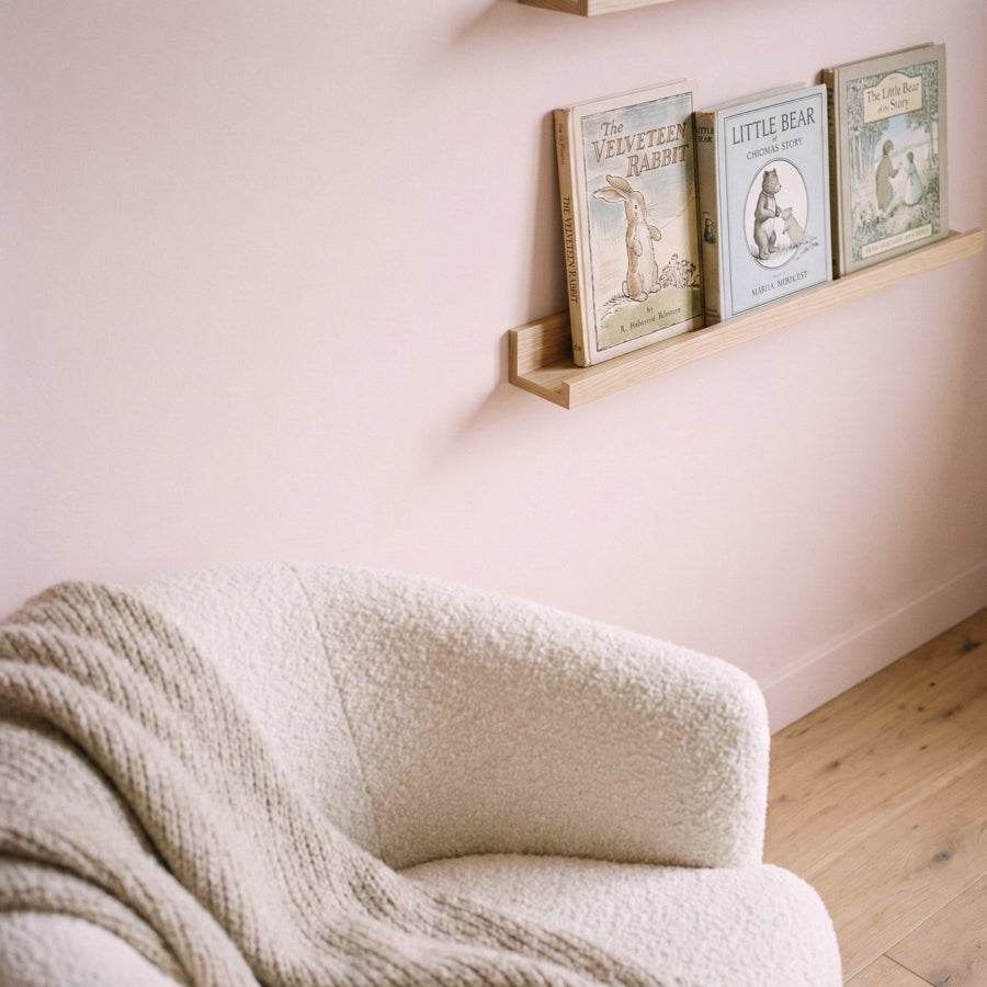
Kyoto Blossom

Every spring, Kyoto does something that stops people in their tracks. The cherry blossoms arrive for roughly two weeks, turning streets and temple gardens into something that feels genuinely hard to believe. It is not loud. It is not dramatic. It is just quietly, completely beautiful.
Kyoto Blossom is the colour of that moment. A gentle, soft pink with enough warmth in it to feel considered rather than sweet. Not a nursery pink. Not a statement pink. The kind of pink that works in a bedroom and looks even better six months later when you have lived with it through different seasons and different light.
In British interiors it sits particularly well in bedrooms and sitting rooms where you want softness without going neutral. It pairs naturally with the aged plasterwork and original cornicing of Victorian and Edwardian houses, and it brings warmth into new builds where the light can be flat and the walls tend toward the aggressively white. If you have been meaning to try colour but find yourself gravitating toward safe choices, Kyoto Blossom is where to start.
It is also the kind of colour that works beautifully colour drenched, that is to say taken across the walls, ceiling and woodwork in a single shade. Multi-surface and ultra low VOC, one tin covers everything without needing separate products for the skirting boards.
Order a sample of Kyoto Blossom from £5.50.
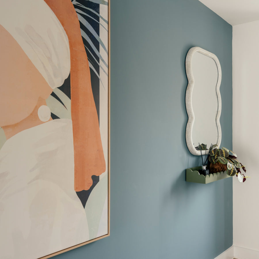
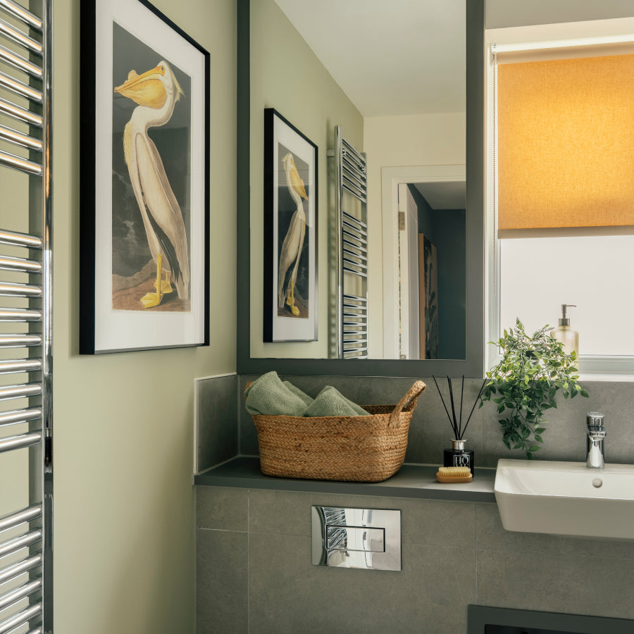
Santorini Azure

The whitewashed villages of Santorini have been inspiring interior trends for decades, and with good reason. That combination of brilliant white walls and deep blue domes against a cloudless sky is so immediately transporting that half the interiors industry spends the summer trying to bottle it.
Santorini Azure is our version of that sky, taken down to something genuinely liveable. It is a barely-there blue, more of a whisper than a statement, with the softness of a clear morning before the heat builds. Nothing chalky or flat about it. In a bathroom it brings the feeling of somewhere better without the kind of bold colour commitment that might feel like a mistake in three years.
In a bedroom it is even better. Studies consistently show that cool, soft blues are among the most conducive colours for sleep, which matters in the British summer when the evenings stay light until nine and you are essentially asking your bedroom to do the work that darkness used to do for you. Blackout blinds are one solution. Santorini Azure on your walls is a gentler one.
It works equally well in open-plan new builds where you want to define a space with colour without creating hard visual barriers, and in older properties where you want to bring a sense of calm into a room that might otherwise feel a bit heavy or enclosed.
Order a sample of Santorini Azure from £5.50.
Baja Seas

Baja Seas is the most committed colour in this edit. It has presence. It knows what it is. Where Santorini Azure is a suggestion, Baja Seas is a decision.
Inspired by the crystal-clear waters off the coast of Mexico's Baja peninsula, this is a cool, refreshing blue with real depth to it. Not navy, not teal, not the kind of generic mid-blue you find on the walls of every rented flat in the country. Something more considered, with the clarity of water you can actually see through and the calm of a coastline that is a long way from a British February.
We chose it for the Summer Edit because it is the colour for anyone who has been thinking about doing something a bit braver with their walls and keeps finding reasons not to. A single feature wall in Baja Seas in a living room changes the entire character of the space. It makes your existing furniture look more deliberate. It makes the room feel finished in a way that neutral walls simply do not.
If you have high ceilings, even better. Baja Seas on a high wall with white woodwork is one of those combinations that photographs beautifully and looks even better in person. In a bathroom with good tiles it becomes something properly special. And because our paint is multi-surface, the same tin goes on your woodwork and radiators too, so you can take the colour further without buying additional products.
Start with a sample. We promise you will want to go bigger.
Order a sample of Baja Seas from £5.50.
How to order
All four colours are available as 125ml sample pots from £5.50, with next-day delivery on orders over £60. Every colour is made to order in the UK, ultra low VOC, and safe for children, pets, and the rest of us who would rather not be breathing paint fumes on a warm evening.
If you have already tested your colour and you know it is the one, full tins start from £28 for a litre, up to £88 for five litres which will cover most rooms twice over.
Any questions, we are always on Instagram at @placepaints. We actually reply.


