


Painting a North-Facing Room: The Colours That Actually Work
North-facing rooms are where paint colours go to die — or so the received wisdom goes. Choose the wrong shade and a room that looked warm and inviting on the colour card will read cold, flat, and slightly sad on your walls. Choose well, and a north-facing room can be one of the most atmospheric spaces in a home: consistent light, no harsh shadows, a quality of stillness that south-facing rooms never quite achieve.
The key is understanding what north-facing light actually does to colour, and choosing accordingly.
What north-facing light does
North-facing rooms in the UK receive indirect light — reflected sky rather than direct sun. That light is bluish in cast, which means it amplifies the cool undertones in any paint colour and suppresses the warm ones. A neutral that looks like warm putty on a colour card will look like cool grey on a north-facing wall. A white with the faintest green undertone will read distinctly green. A pale blue will feel cold rather than serene.
This is not a reason to avoid colour in north-facing rooms. It is a reason to choose colours with enough warmth built into them to hold their ground against a cool light source.
The colours that hold in north-facing light
Warm neutrals with earthy undertones are the most reliable choice. The earthy component — yellow, orange, or red pigment in the base — counteracts the blue cast of north light and keeps the colour reading as warm rather than cool.
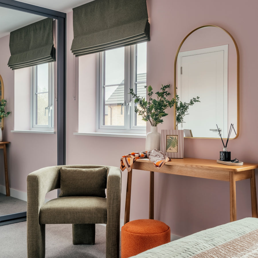
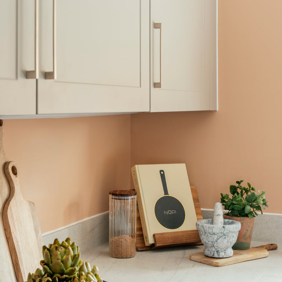
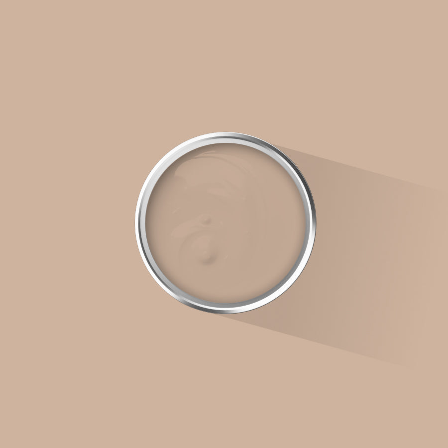
Lisbon Taupe is one of the strongest performers in north-facing spaces. The limestone-inspired warmth in its undertone holds even when the light is at its most indirect. It does not go grey. It does not go cold.
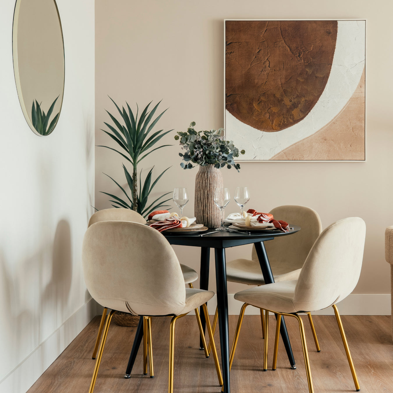
Devon Pebble works well precisely because it has both warm and cool elements — in north light the cool elements are drawn out slightly, giving it a pleasant coastal quality rather than becoming flat or lifeless.
Charlbury Hearth is a warmer, more committed choice — a soft brown drawn from the stone hearths of Cotswold cottages that reads as genuinely cosy in rooms where the light is limited. Good for living rooms and bedrooms where atmosphere matters more than brightness.
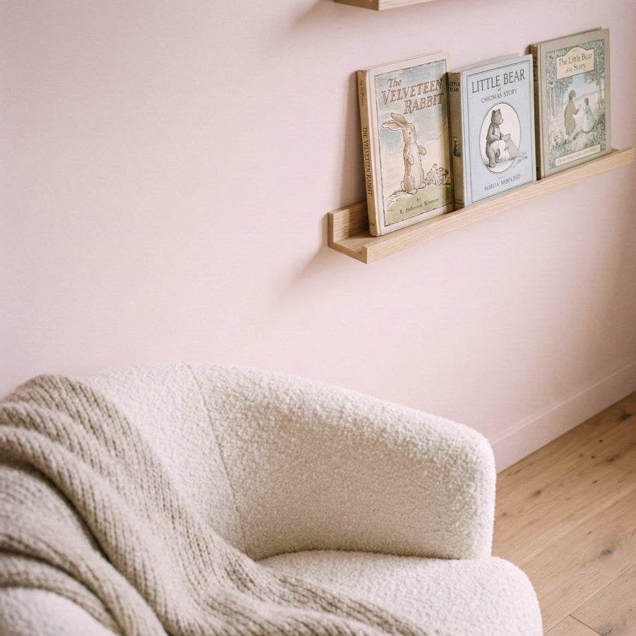
French Linen is worth considering for north-facing rooms that need to feel light as well as warm. The linen undertone keeps it from going yellow, while the warmth in the base stops it reading as cold.
Colours to approach with caution
Pure cool greys will read flat. Pale blues — unless you are deliberately pursuing a cool, Nordic atmosphere — will feel cold rather than calm. Bright whites with no warm undertone will look clinical. Pale greens with blue in the base will look very green indeed.
None of these are categorically wrong choices. They require deliberate intent. If you want a cool, spare quality in a north-facing room, lean into it. If you want warmth, choose colours with enough yellow or red in the base to push back against the light.
The only reliable test
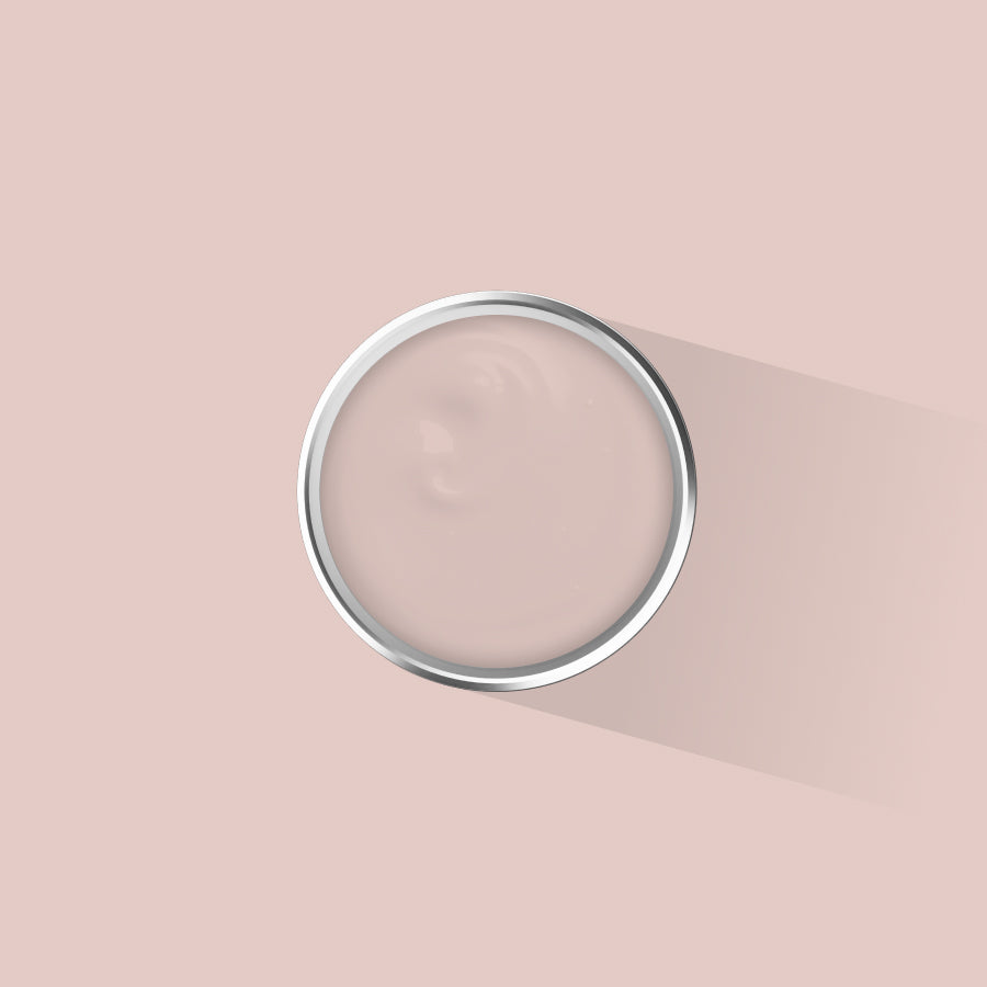
No colour card or screen can tell you how a colour will behave on your specific walls in your specific light. The only way to know is to paint large swatches — A3 minimum — and look at them at different times of day and under your artificial lighting in the evening. A 125ml sample pot gives you enough paint for meaningful swatches on two or three walls.
Placepaints sample bundles start at £18 for four colours from the same family, or build your own selection of any four for £20. Standard delivery is 2–3 days. If you are choosing a neutral for a north-facing room, The Perfect Neutrals bundle — Lisbon Taupe, Devon Pebble, Vienna Stone, and Pretty Porto — is the most useful place to start.


