


The Best Neutral Paint Colours for 2026 — And Where to Find Them
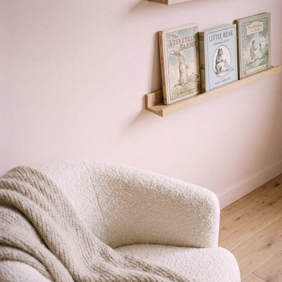
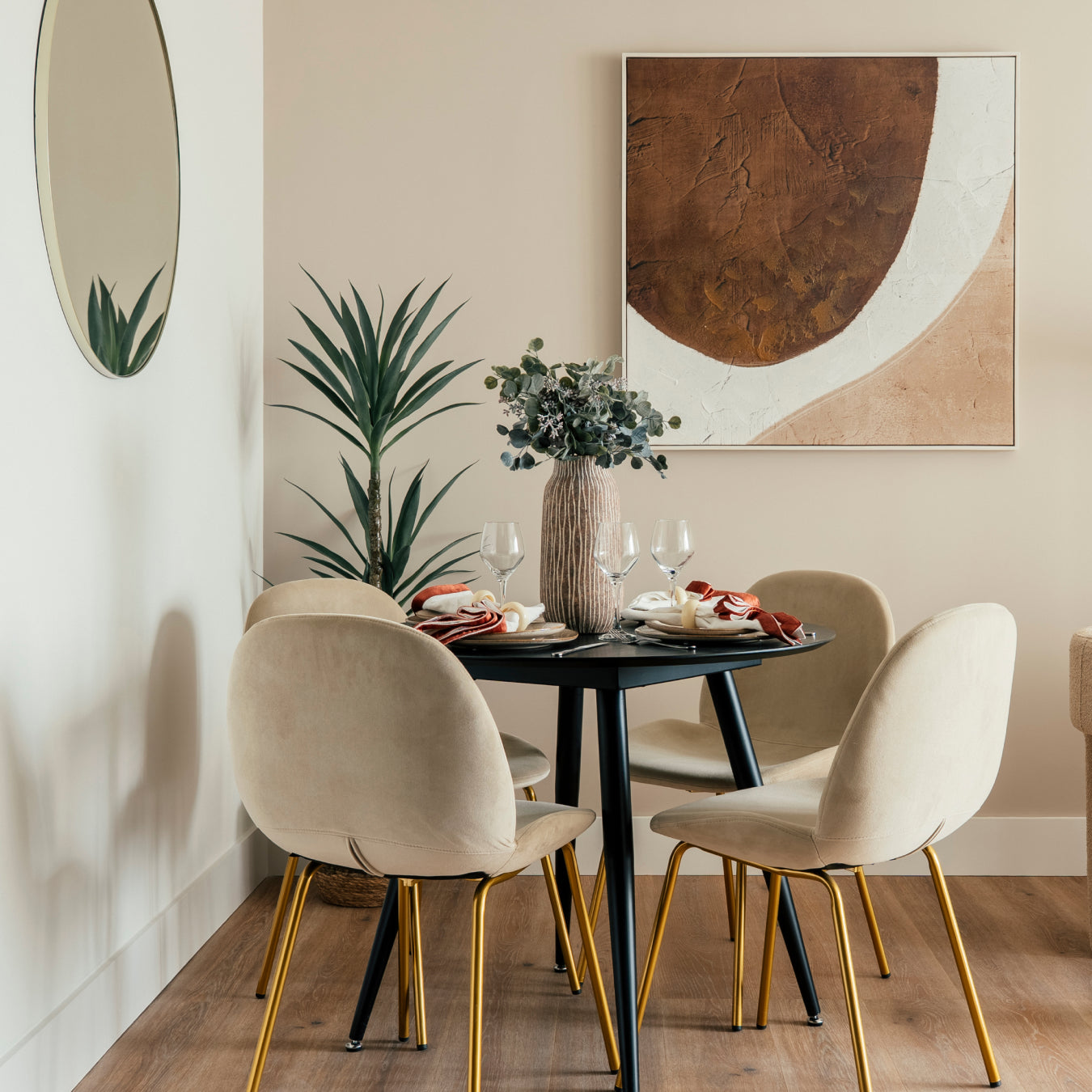
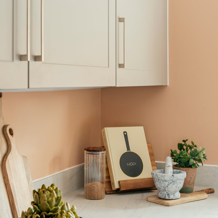
The neutral is having a moment — not that it ever really stopped. But the neutrals that are resonating in 2026 are different from the cool greys and clinical off-whites that dominated the previous decade. Warmer, earthier, more considered. Colours with a sense of place rather than a desire to disappear.
Here are the neutrals worth knowing about this year.
The shift away from grey
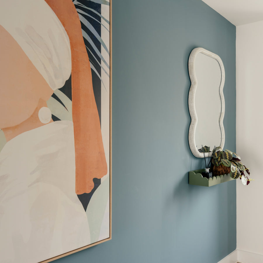
Grey has been the default neutral for fifteen years. It is safe, it photographs well, it works with almost everything. It has also been done to death. The interiors that feel most current right now are warmer — taupes, warm stones, soft linens — and they are choosing neutrals that have a character rather than an absence of one.
This does not mean grey is wrong. A well-chosen grey is still one of the most versatile things you can put on a wall. But the grey that works in 2026 is one with some warmth in it, some specificity. Not a generic warm grey, but a colour that earns its place.
The neutrals to know
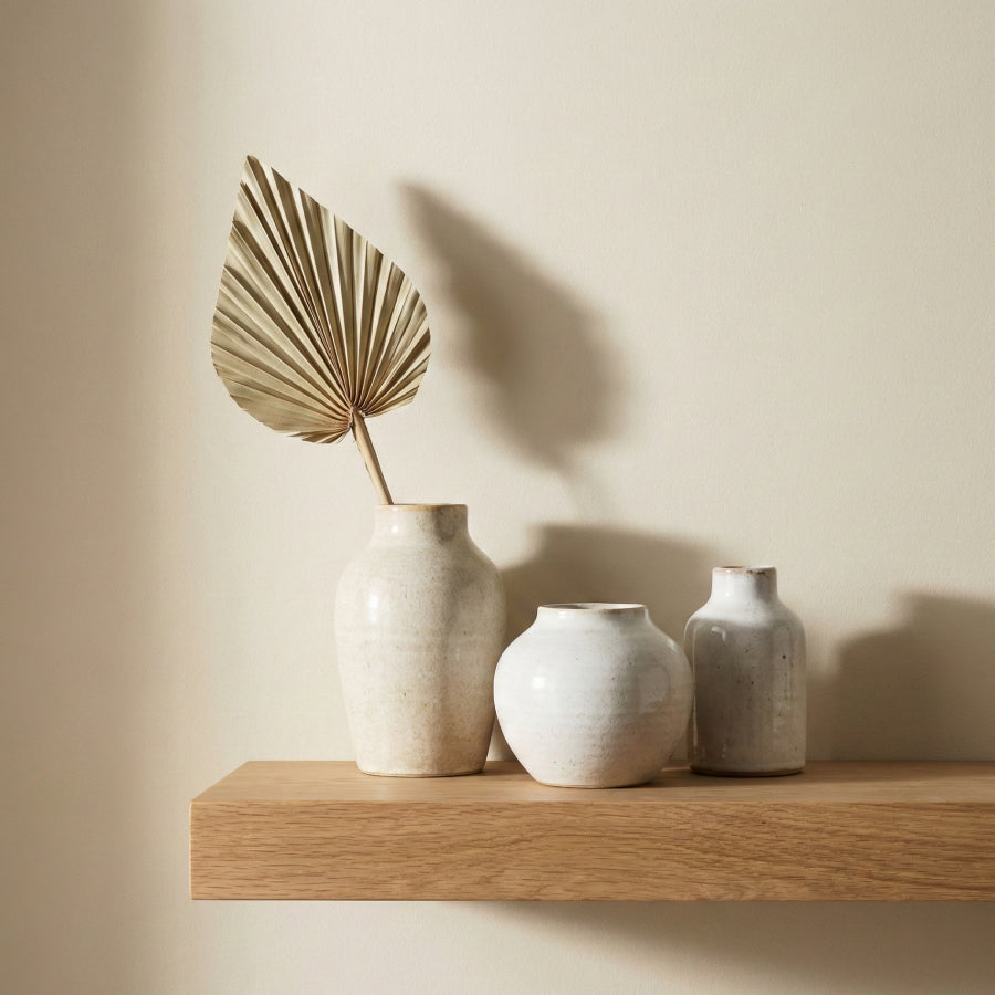
Lisbon Taupe — warm, earthy, limestone-influenced. The kind of taupe that reads golden in morning light and settled in the evening. One of the most versatile neutrals currently available from any UK brand.
Devon Pebble — cooler, coastal, with a quality that shifts through the day. Works in almost any orientation, which makes it the go-to recommendation for anyone who has been burned by a neutral that turned cold in north-facing light.
Vienna Stone — lighter and more classical. Closer to a warm white than a taupe, it works on ceilings and woodwork as well as walls, and makes smaller rooms feel larger without feeling stark.
French Linen — an airy, effortless neutral drawn from the linen of Provence's rustic countryside. Understated in a way that takes skill to achieve.
Stockholm Birch — for the Scandinavian-influenced interior. Muted, calm, a neutral that manages to feel both warm and considered.
All five are available from Placepaints as 125ml sample pots for £5.50, and as part of The Perfect Neutrals bundle — four pots for £18.
How to choose the right neutral for your room
The single most important factor in choosing a neutral is orientation. North-facing rooms strip warmth from paint colours — what reads as a warm stone in the showroom will read as a cool grey on your wall. East-facing rooms have good morning light and flatten in the afternoon. South and west-facing rooms are the most forgiving.
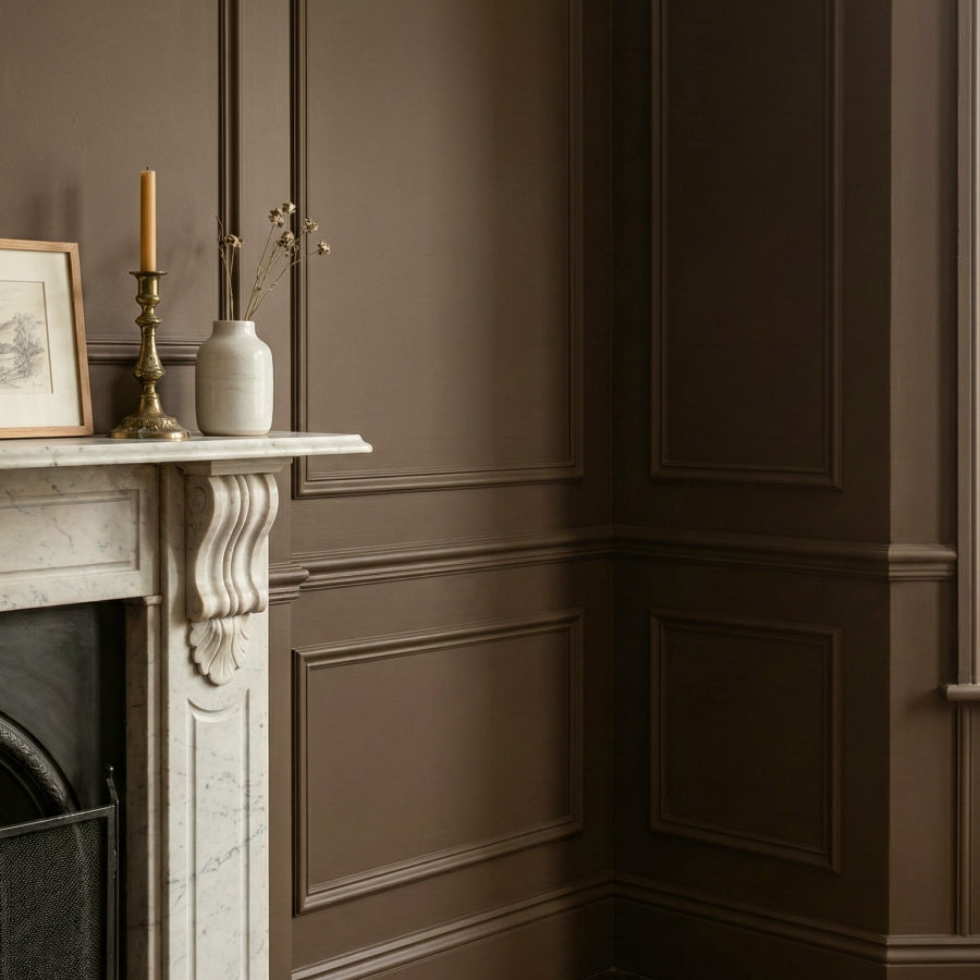
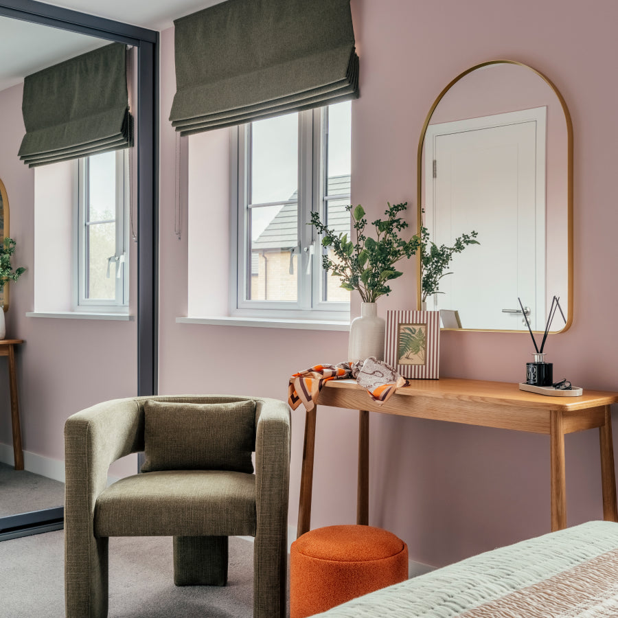
The second factor is what you are pairing the neutral with. A warm neutral works beautifully with natural oak, aged brass, and linen. A cooler neutral sits better with painted woodwork, marble, and chrome.
The third factor — and the one most people skip — is artificial light. See your shortlisted colours in lamplight as well as daylight before committing. Neutrals behave very differently once the sun goes down.


