How to paint your walls like a professional: a guide to interior emulsion
Painting your walls is one of the most transformative things you can do to a room. Done well, it is barely perceptible — the colour simply becomes the room, as if it was always meant to be that way. Done poorly, it telegraphs every mistake for years. The difference between the two usually comes down to preparation, patience, and choosing a paint that behaves the way you want it to. This guide covers the things that actually matter: surface preparation, application technique, and four colours that make the whole process feel considered rather than corrected.
Interior emulsion is a water-based paint formulated specifically for walls and ceilings. Its advantage over oil-based alternatives is straightforward — lower VOC emissions, faster drying, easier clean-up, and a finish that breathes alongside the wall rather than trapping moisture beneath it. Placepaints is ultra low VOC, water-based, and suitable for lime plaster and historic masonry as well as standard plasterboard. You will not need to open every window in the house to use it safely, though it is always sensible to ventilate.
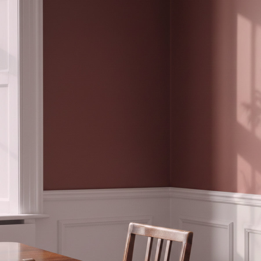
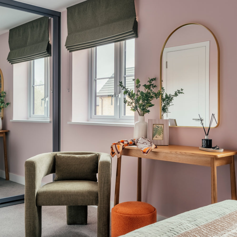
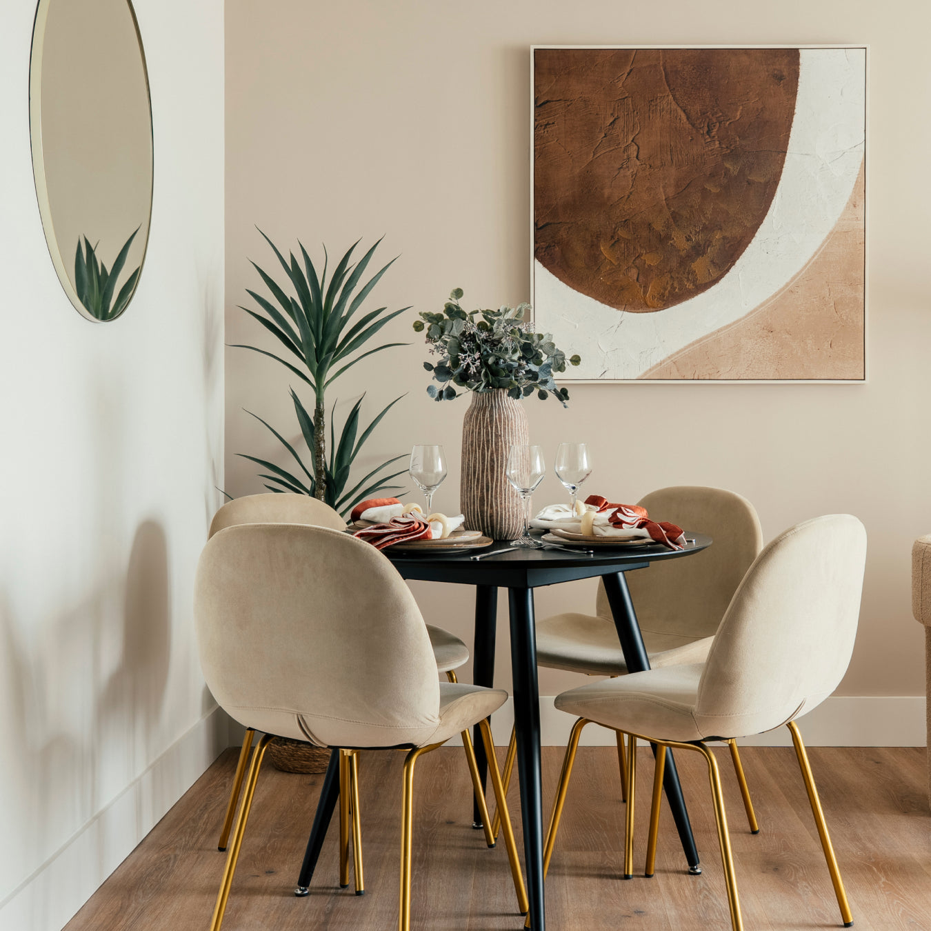
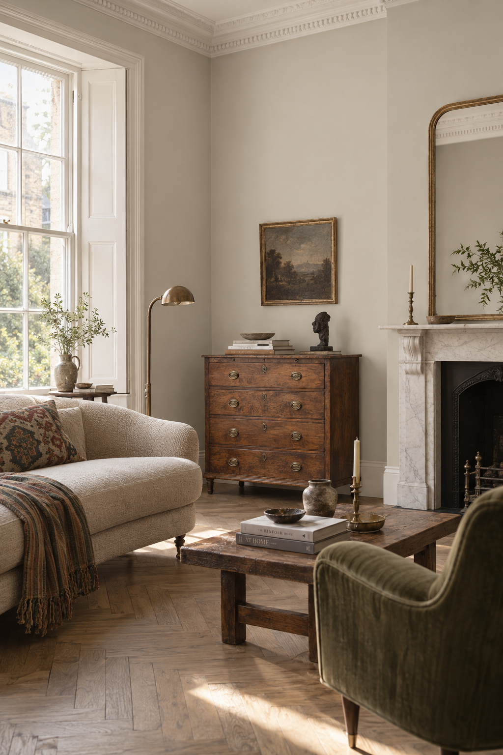
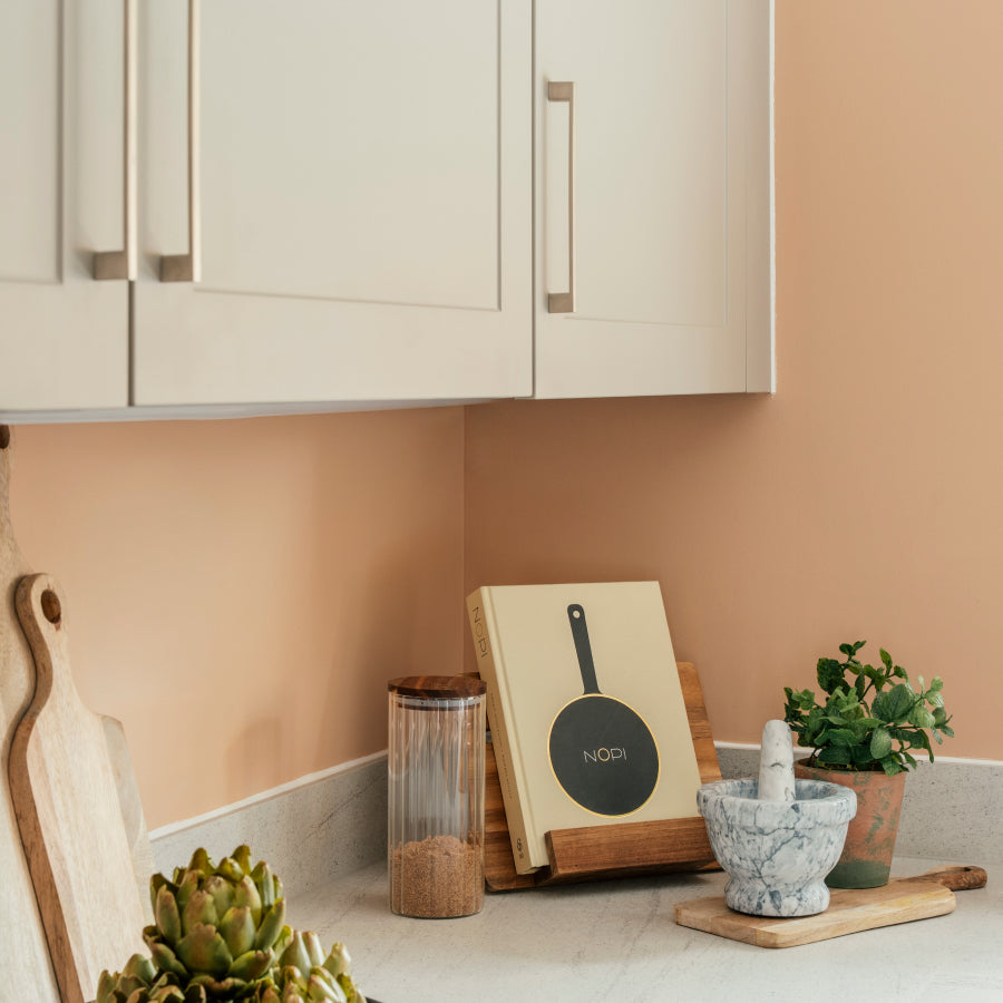
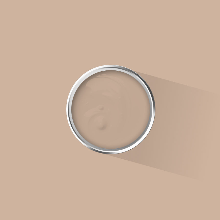
The four colours we have chosen for this guide reflect the particular quality of British summer light: warm without being oppressive, soft enough to sit comfortably alongside linen, timber, and the off-white of a sash window frame. Each one rewards careful application and rewards the room more generously the more naturally it is lit.
The four colours at a glance
- Lisbon Taupe — a warm, sunlit neutral with effortless depth, samples from £5.50
- Baja Seas — a refreshing cool blue drawn from the Pacific coastline, samples from £5.50
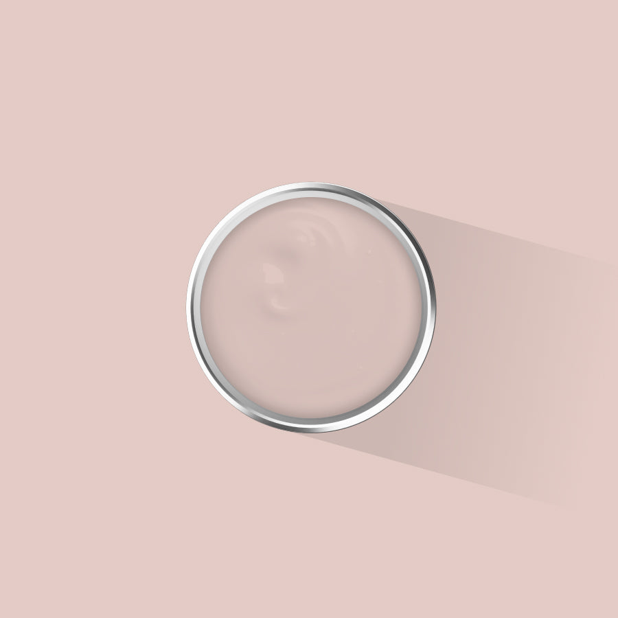
- Devon Pebble — a soft, grounding neutral balancing warmth and coolness, samples from £5.50
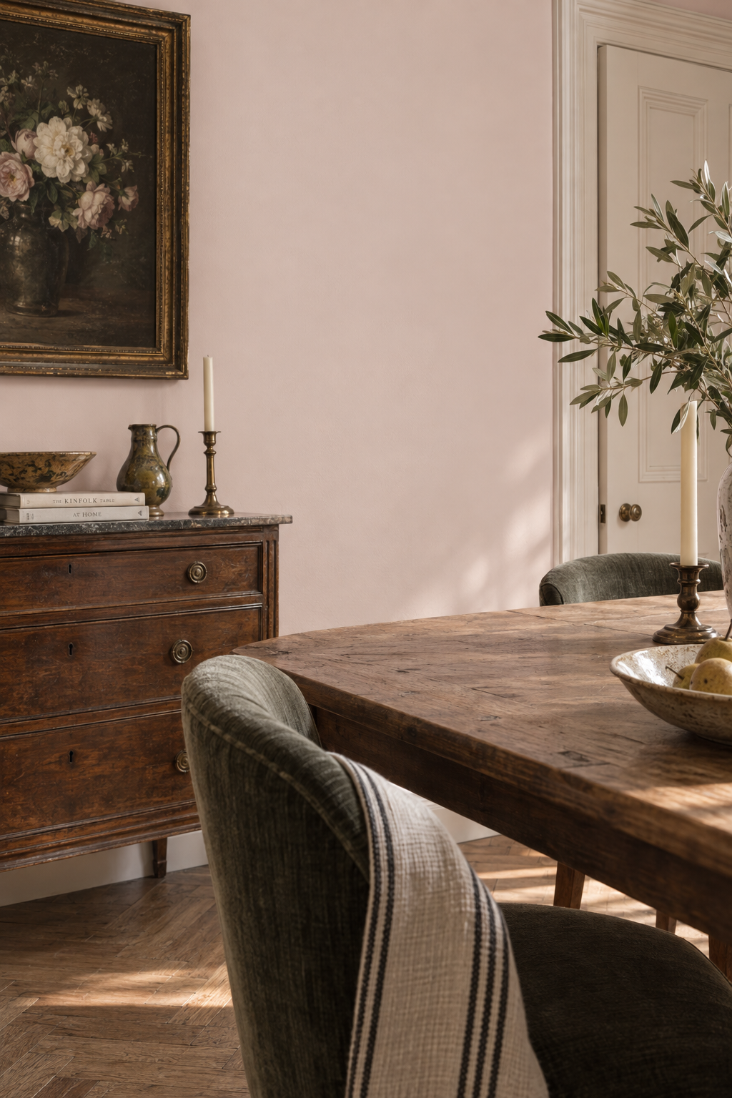
- Glen Spring — a barely-there off-white green with a gentle mineral freshness, samples from £5.50
Lisbon Taupe

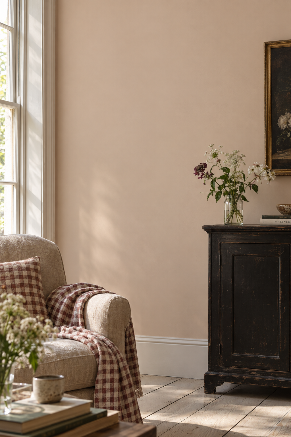
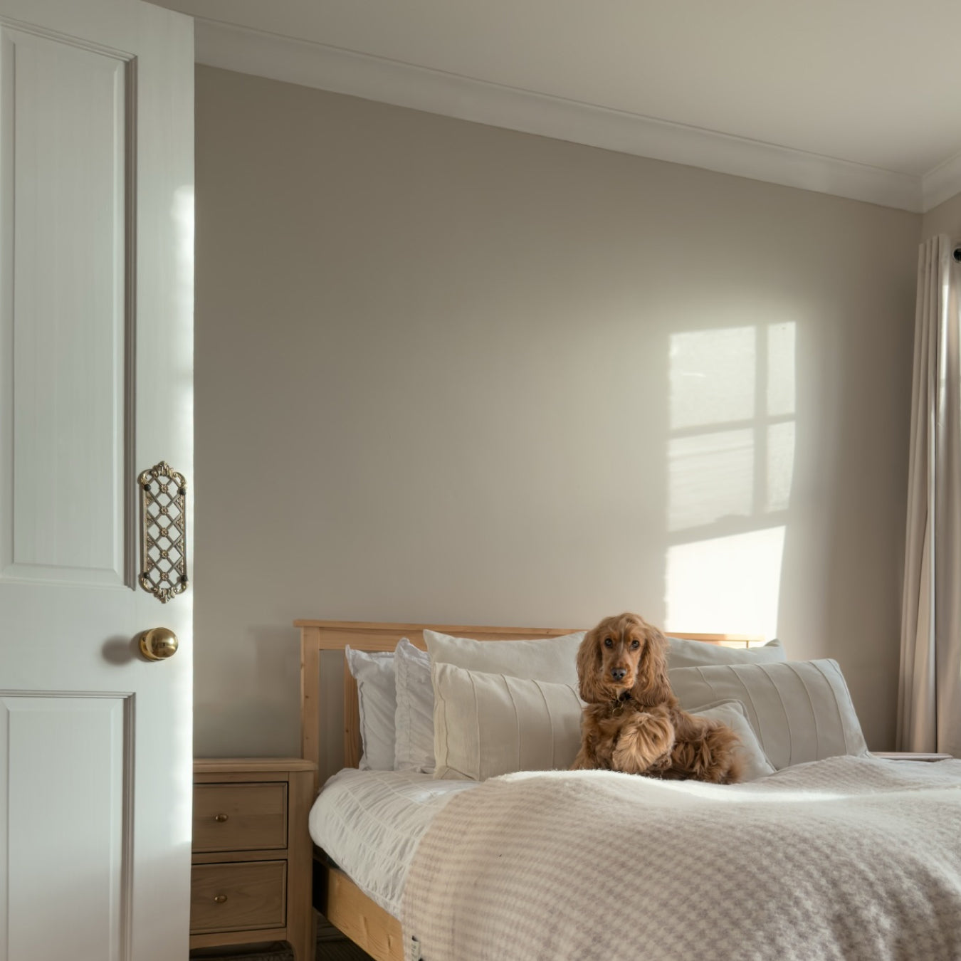
Inspired by the sunlit facades of Portugal's capital, Lisbon Taupe sits in that rare register between warm and cool — a neutral that never reads as flat. In strong summer light it pulls towards honey; in the softer tones of an overcast British afternoon it settles into something quieter and more considered. It is a colour that changes with the room rather than competing with it.
When applying Lisbon Taupe, allow the first coat to dry fully before assessing coverage. The true depth of this colour only becomes apparent on the second coat, at which point any instinct to rush will have passed. Apply with a short-pile roller (9mm nap is ideal for a smooth plaster finish) and cut in with a 50mm brush along architraves and ceiling lines. Work in manageable sections to maintain a wet edge and avoid lap marks.
This colour works particularly well in living rooms and hallways that receive morning or late afternoon light. Pair with warm timber flooring and off-white woodwork to let the warmth breathe. For north-facing rooms it holds its warmth well, though a south-facing room will bring out the most in it during the longer summer evenings.
Order a sample of Lisbon Taupe from £5.50.
Baja Seas

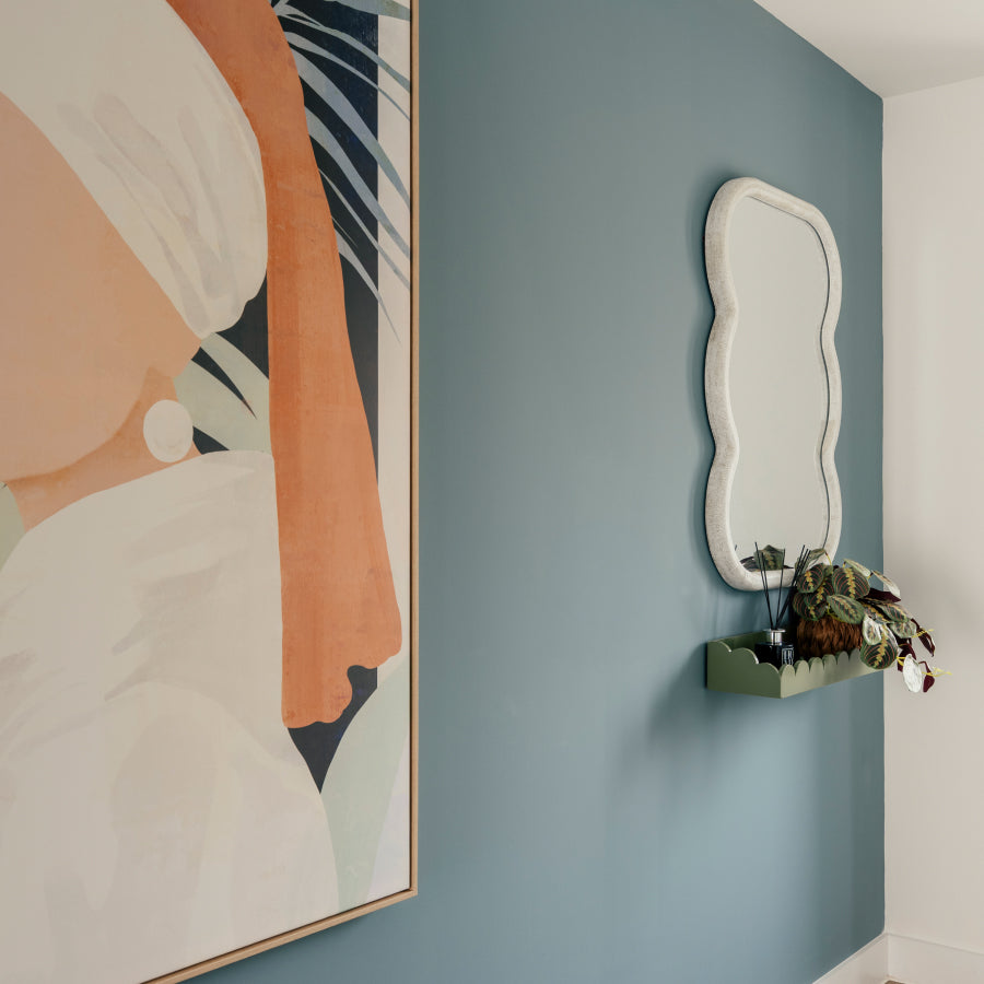
There is a quality to the light above the Pacific coast at Baja that is difficult to describe without sounding vague — it is extraordinarily clear, almost metallic, and the water beneath it holds the sky in a way that makes both seem more saturated than they are. Baja Seas captures that. It is a cool, refreshing blue that feels particularly at home in summer, in rooms that face south or west where the afternoon light can find it.
Blue emulsions require attentive application because the pigment weight can vary between coats. Mix the tin thoroughly before you begin — not just a quick stir but a proper 60 seconds of mixing to ensure the pigment is evenly suspended. Apply the first coat and allow it to dry for a minimum of two hours (more in humid conditions). The second coat will correct any unevenness and deliver the clarity of tone that photographs rarely capture accurately.
Baja Seas reads well in bathrooms, bedrooms, and in smaller spaces where a cool blue can read as an expansion of the room rather than a compression of it. It pairs beautifully with aged brass fittings, white cotton, and natural oak. In a bathroom setting, ensure adequate ventilation after painting — not because of VOC levels, which are ultra low, but simply to allow the emulsion to cure properly in a humid environment.
Order a sample of Baja Seas from £5.50.
Devon Pebble

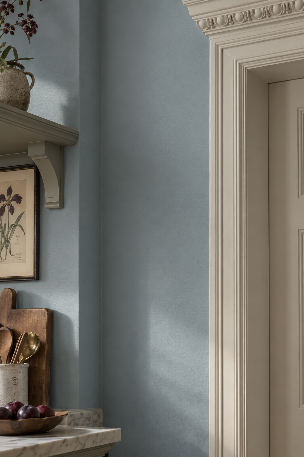
The pebbles along Devon's coastline are remarkable not for their colour but for their restraint — worn smooth by centuries of tide, they hold warmth and coolness in equal measure depending entirely on the quality of the light above them. Devon Pebble does the same. It is a soft, grounding neutral that will read differently in different rooms and at different times of day, which is exactly what you want from a paint that you will spend a great deal of time with.
For a colour with this kind of tonal depth, surface preparation is especially important. Any existing paint should be in good condition — flaking or powdery surfaces will compromise adhesion and the matt finish will make imperfections more visible rather than hiding them. Sand back any loose areas, prime bare plaster, and allow plaster to dry fully before painting. New plaster should be allowed a minimum of four weeks to cure before applying emulsion, and a mist coat (emulsion diluted 10% with water) is recommended as a first coat to allow the plaster to breathe and accept the paint properly.
Devon Pebble works across rooms with confidence. Use it in bedrooms for its calming quality, in living rooms for its warmth, or in a hallway as a colour that connects spaces without demanding attention. It is particularly good alongside natural linen, dark stained timber, and warm white ceramic.
Order a sample of Devon Pebble from £5.50.
Glen Spring

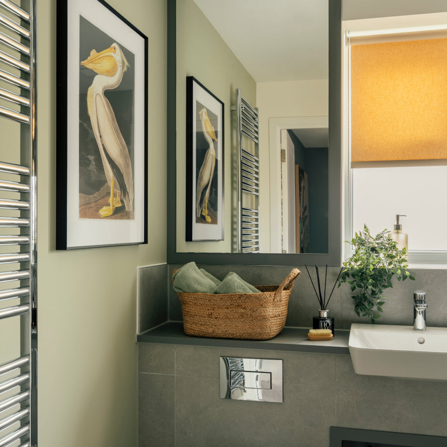
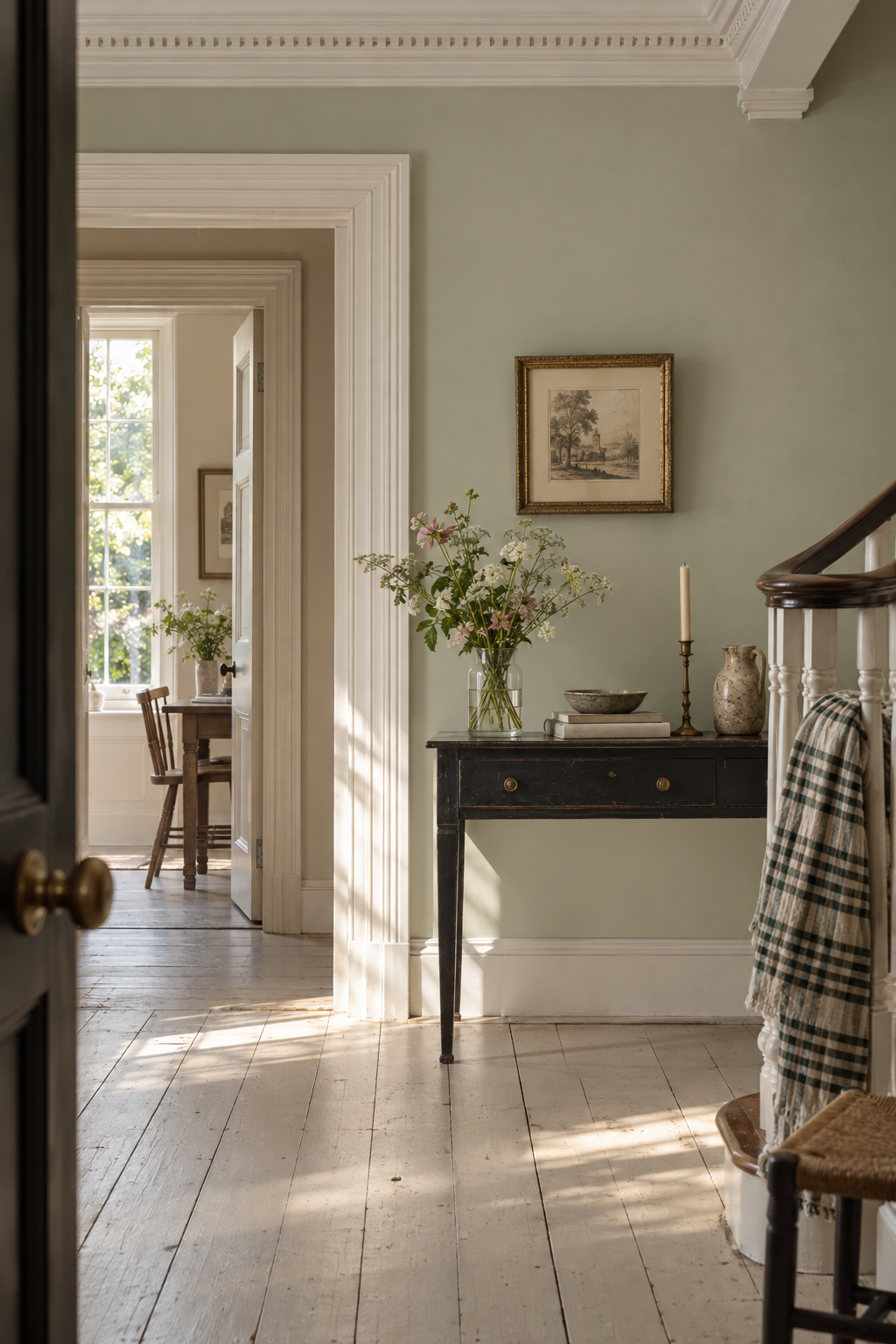
Glen Spring belongs to that category of colour that is almost impossible to name accurately from a swatch. In isolation it reads as an off-white with a cool mineral undertone; on a wall in a south-facing room it becomes something closer to pale sage, lifted by the light until it barely registers as a colour at all. This is its particular quality and its considerable appeal. It makes rooms feel clean, aired, and alive without ever announcing itself.
Very light colours like Glen Spring require particular care at the cutting-in stage. The line between paint and ceiling or woodwork is more visible against a pale wall than a darker one, so take time with this step. Use low-tack masking tape along ceiling lines if your hand is not steady, and remove the tape while the paint is still slightly wet to avoid tearing the film. A second cut-in coat is rarely necessary but ensures evenness at the edges where a roller cannot reach.
Glen Spring is ideally suited to rooms that benefit from opening up — small bedrooms, bathrooms, and any space that you want to feel cooler and more spacious. It works especially well in south-facing rooms where the light is strong enough to bring out the green without making the room feel cold. Pair with warm natural materials to balance the mineral quality of the hue.
Order a sample of Glen Spring from £5.50.
How to order
All four colours are available as 125ml sample pots from £5.50, with next-day delivery on orders over £60. Every colour is made to order in the UK, ultra low VOC, and safe for children, pets, and the rest of us who would rather not be breathing paint fumes.
If you have already tested your colour and you know it is the one, full tins start from £28 for a litre, up to £88 for five litres which will cover most rooms twice over.
Any questions, we are always on Instagram at @placepaints. We actually reply.